Overview
Mint needed to stand out in the age of digital transformation. We recognised the need for them to differentiate themselves. We overhauled their brand in 3 stages:
Reposition > Rebrand > Relaunch
Reposition
We recognised that the industry was stuck in a tech-first paradigm, where clients were promised added value that was just repurposed one-size-fits-all solutions. After a thorough interrogation of their business’s strategic objectives and we decided a full repositioning within the industry was needed.
Mint is going to challenge the status quo because technology solutions should exist to make the human experience simpler, easier, more efficient, and more exciting.
Value Proposition
FIRST. FRESH. FUTURE-PROOF.
Mint will help you create a future-proof, sustainable business with what we call the Better
Business Principle - a fresh approach to adaptive software that is geared towards helping your business achieve success.
Better Business is worth both the effort and the cost. It’s about a business that knows the value of improving the experiences of all the people that come into contact with it by using customised, adaptive software solutions that will deliver measurable change and drive lasting success.
Rebrand
Better Business is about the future. It is about creating your own tomorrow, starting today.
Mint invites you to join them and
Create tomorrow.
and build your business beyond today.
Humanising offerings
As a software technology company, Mint needed to connect their software offerings with those that interact with them. We needed to humanise the offerings.
Customer Relationship Management is about creating a customer-centric philosophy and ethos.
Enterprise Content Management is to aid employees in their work, engaging them fully.
Cloud Application Management is about smarter systems that are intuitive, functional and work for the people that use them.
So, what does tomorrow look like?
Tomorrow is not futuristic and cold. It is not all robots and spaceships.
Tomorrow is dependent on touch – intelligent, engaging, and highly personalised. Vibrant, eye-catching design that is textured and layered to create a meaningful visual narrative to draw people into experiences in the real and digital world.
Old Mint logo vs new Mint logo
Logo
We deconstructed their old logo, drawing out the circle into the 3 branches of the business, and layering them to create one kinetic, adaptable, and organic whole.
It represents an iterative process, with solutions that evolve as time goes by and insights improve. Good solutions are made up of much more than just one final answer. It’s a process, not a product, and represents Mint’s commitment to finding unique solutions for their client.
It is also scalable, fresh, and modern to reflect the ‘create tomorrow’ tagline.
The Colour Palette
Using material design as inspiration, we introduced modern and bright, web-friendly colours and tones which liven up the brand.
Iconography
To compliment the logo and further strengthen the brands' visual identity, we created a custom set of icons to be used across collateral. Imagery
Imagery plays 'n major part in the brand and we created an image library where technology and people are seamlessly integrated. We further made sure that all the images had a rich tone and dynamic settings.
Branded Elements and Relaunch
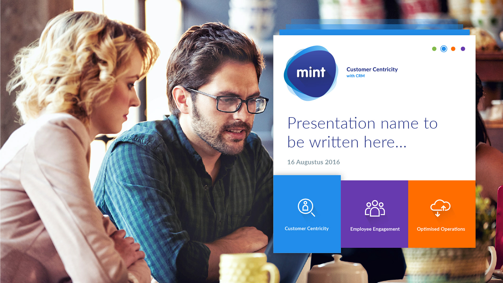
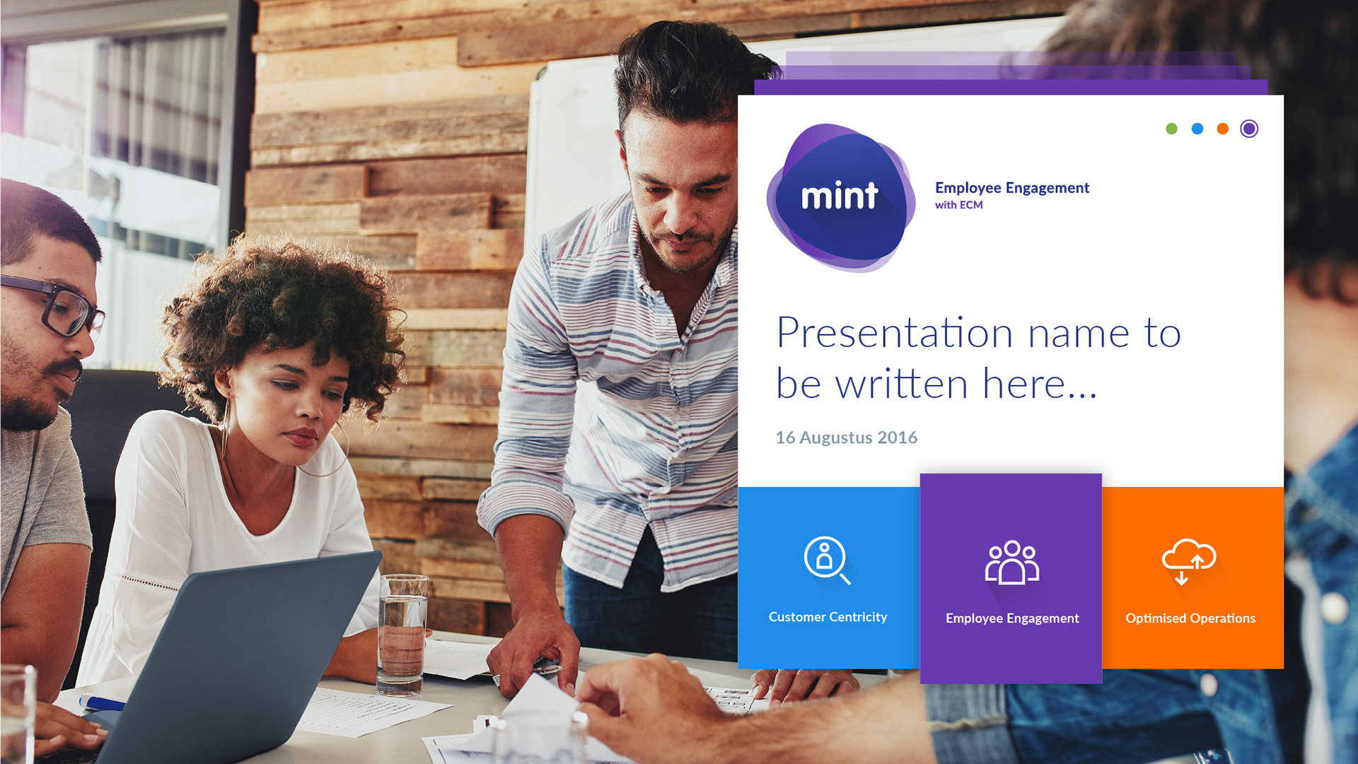
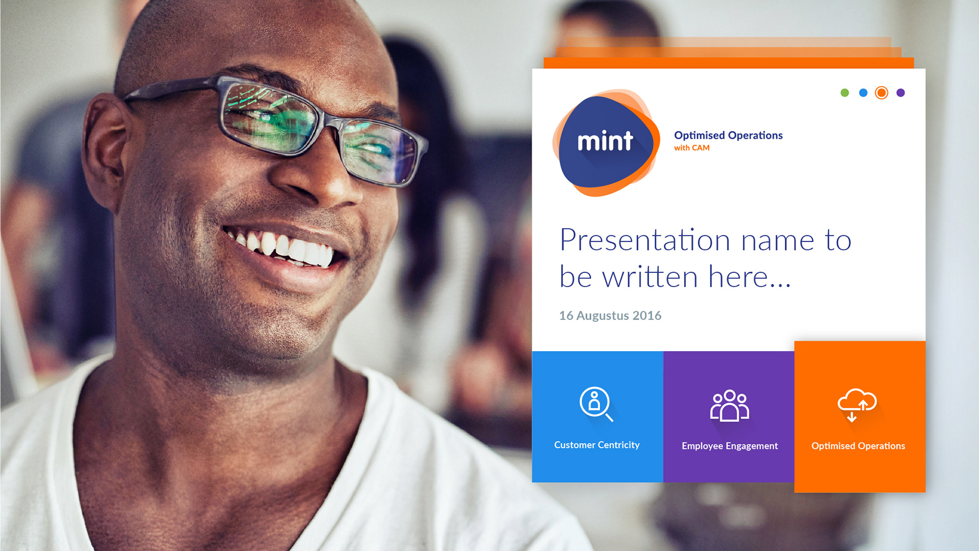
Coherent visual elements are key across a brand. We created PowerPoint presentations, newsletters, sales kits, banners, etc for each department within Mint and made sure that all of the departments visually aligned under the master brand.
The new brand was rolled out across multiple platforms to maximise impact and launch the new website and branding.
Starting with a ‘black ops’ company survey and the Better Business Case Study we compiled as an incentive to complete.
We created thought leadership articles to boost Mint’s positioning as industry leader and challenger.
We also created a full social calendar and plan across Facebook, Twitter, and Linkedin that focused on awareness, engagement, and conversation.
We created over 440 000 impressions on social media over the course of their launch campaign.
The Website
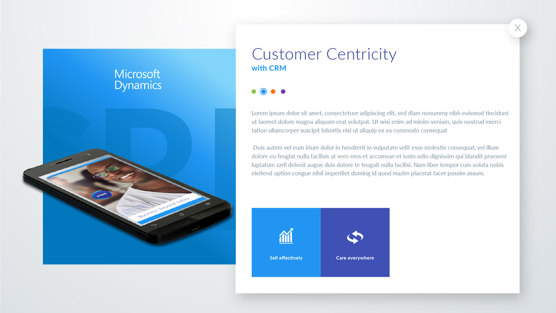
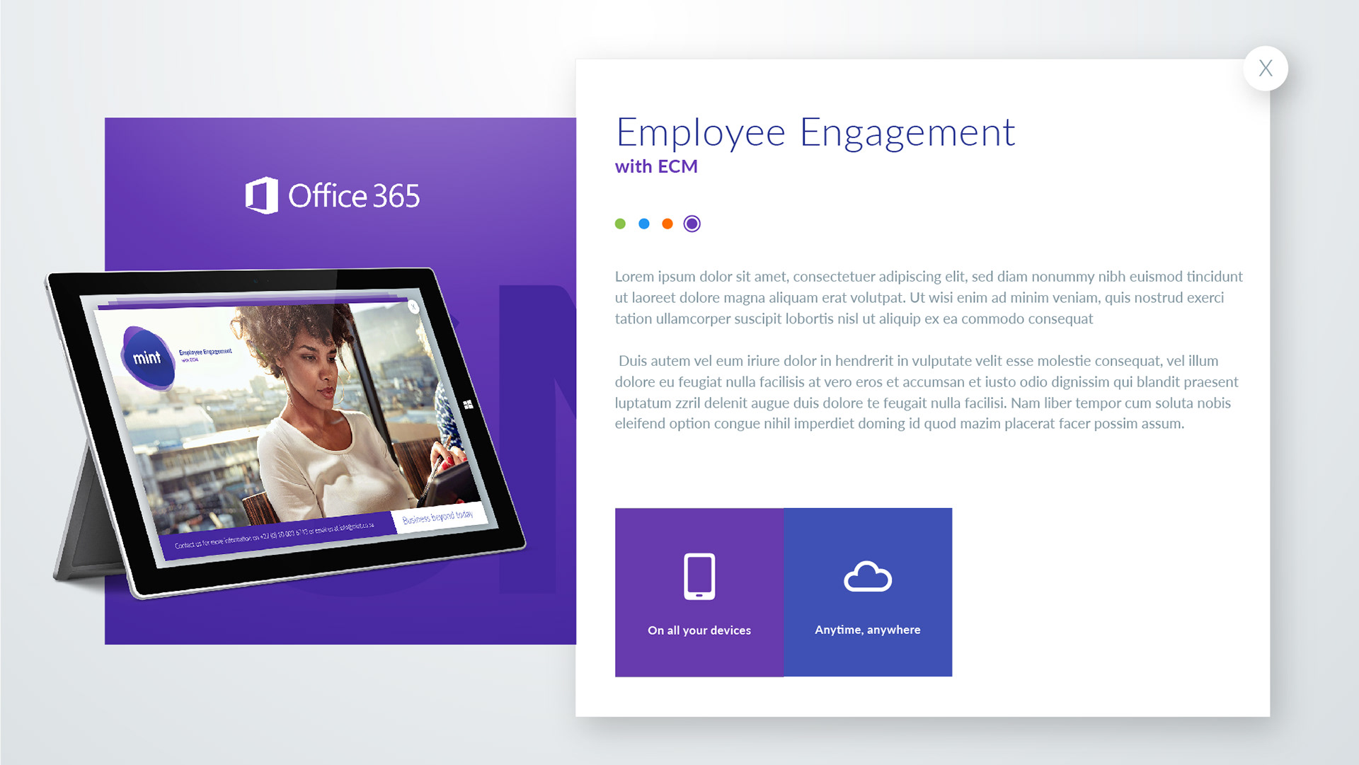
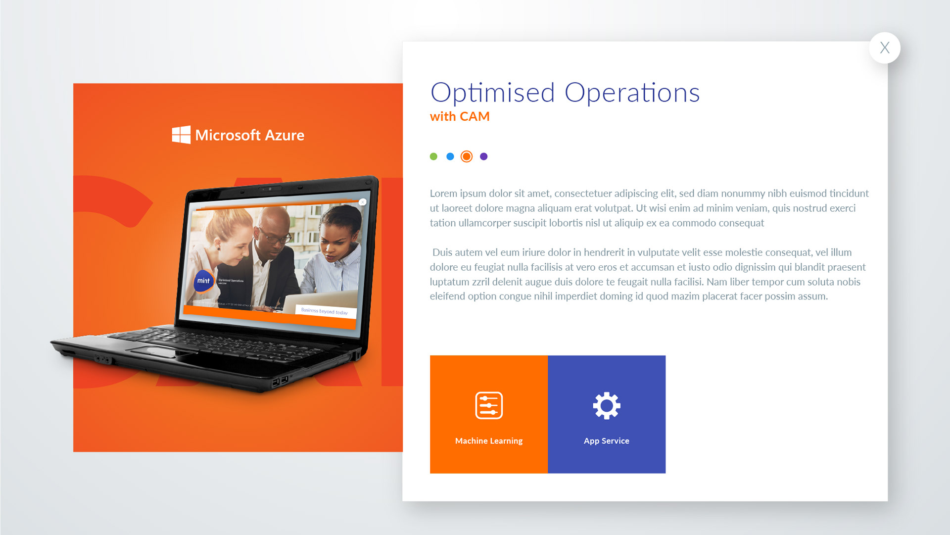
We redesigned the website from scratch, employing user-centered design and focusing on information architecture and user experience to ensure that users would be able to get the information they were looking for and have a great experience whilst doing so.
Outcomes
A successful move away from service-related marketing, to brand-led marketing - with business decisions aligned to brand strategy, customer segments, and their unique needs - delivering benefits such as:
Better brand consistency.
Better brand recognition.
More credibility & higher customer loyalty.
Better buy-in by employees and potential talent (brand values & purpose).
Better in-market performance against competitors.
My Responsibilities: Creative Direction, Art Direction, Design, and production
Range of work: Logo, Iconography, Visual Identity, website, and Social Media design
Design work done for Crio Agency