Client
Piza e Vino was going to open their flagship restaurant around the corner from the popular design square in Melrose Arch, Johannesburg (South Africa) and came to us to conceptualise a modern and fun brand and visual identity for their restaurant. The main objective was to challenge the norms of the traditional Italian-style restaurant and push the boundaries of the designed space.
Inspiration
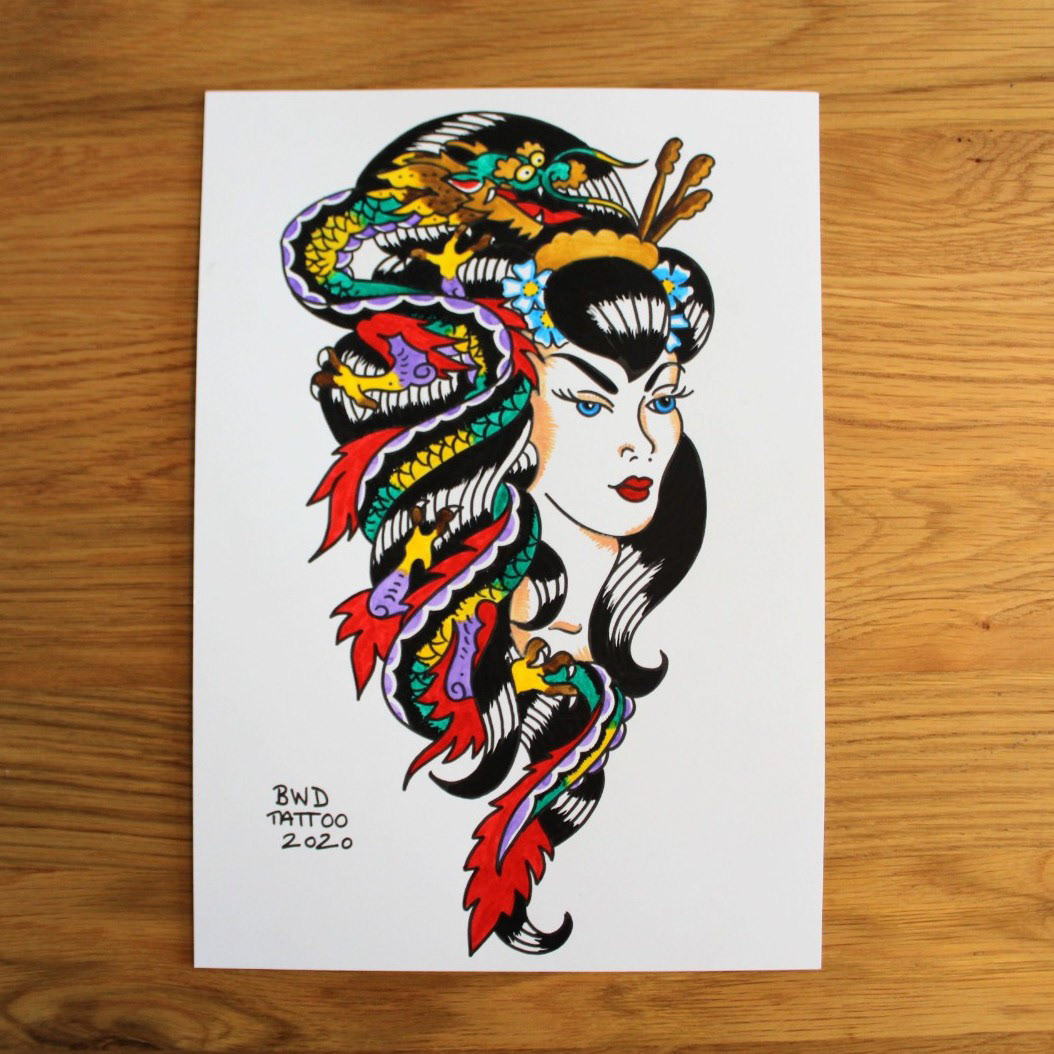
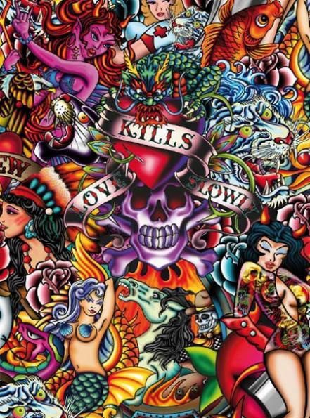
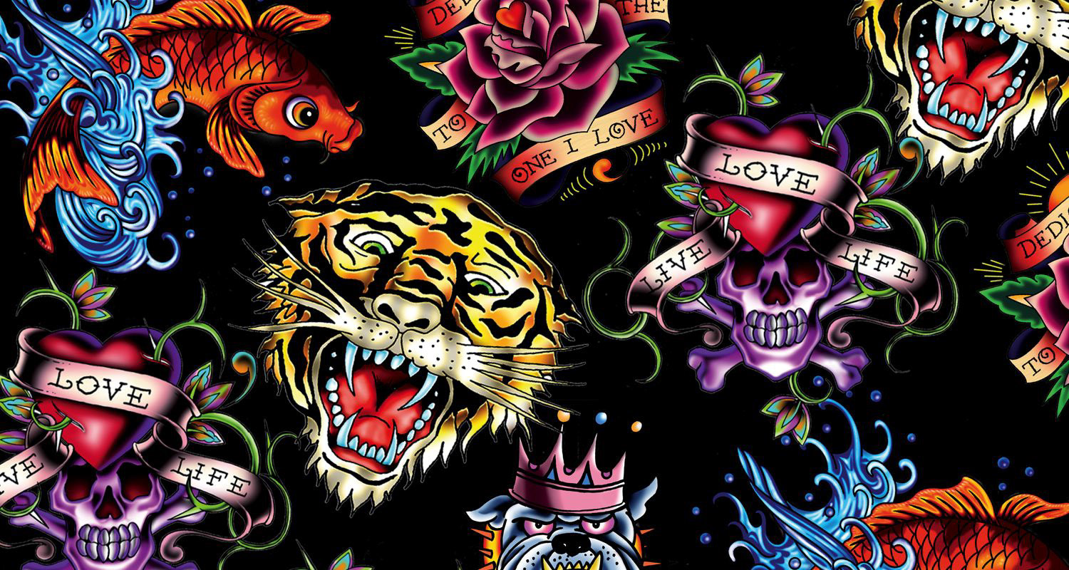
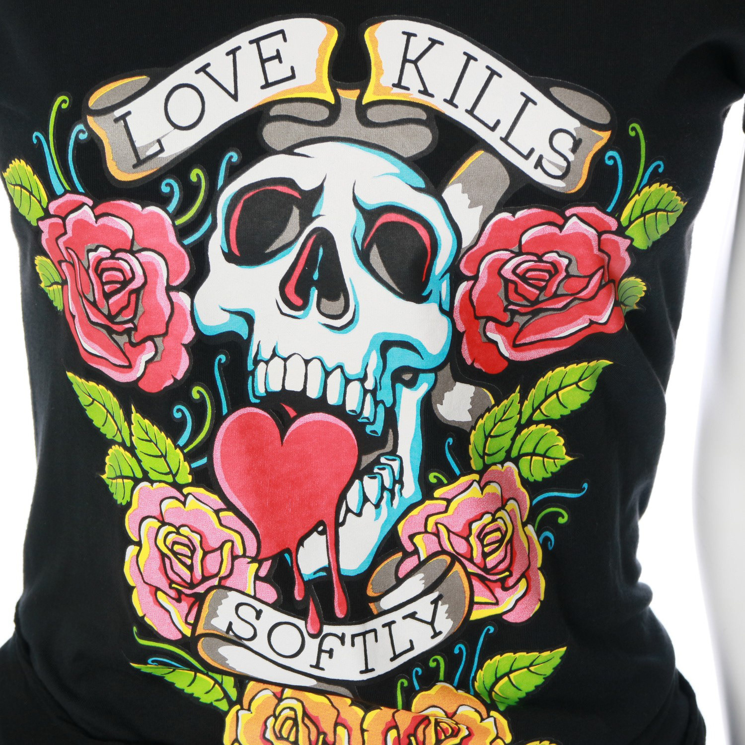
Inspired by the intricate illustrations of Ed Hardy, we created fun and lively illustrations to tell the love story of Italian cuisine - in particular the one between pizza and wine.
Result
I created simple, bright and playful, tongue in cheek illustrations to breathe colour and life into the brand.
These illustrated elements were used on branded items as well as the interior space with the use of mosaic tiles on pillars, main walls and pizza ovens. This made the brand flow seamlessly between the interior and branded items giving patrons an immersive brand experience whilst dining at Piza e Vino.
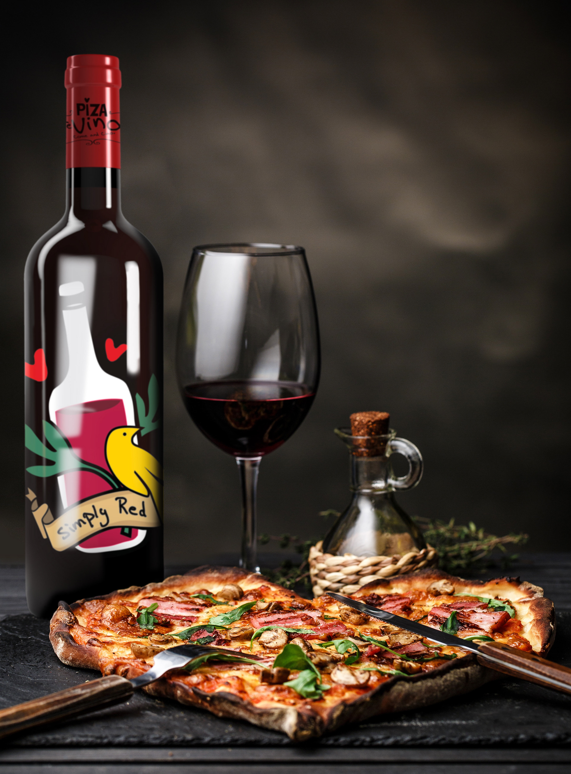
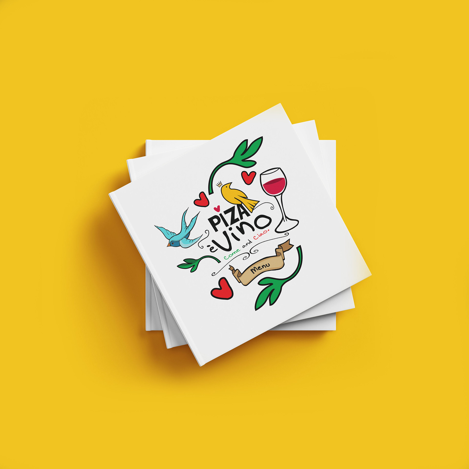

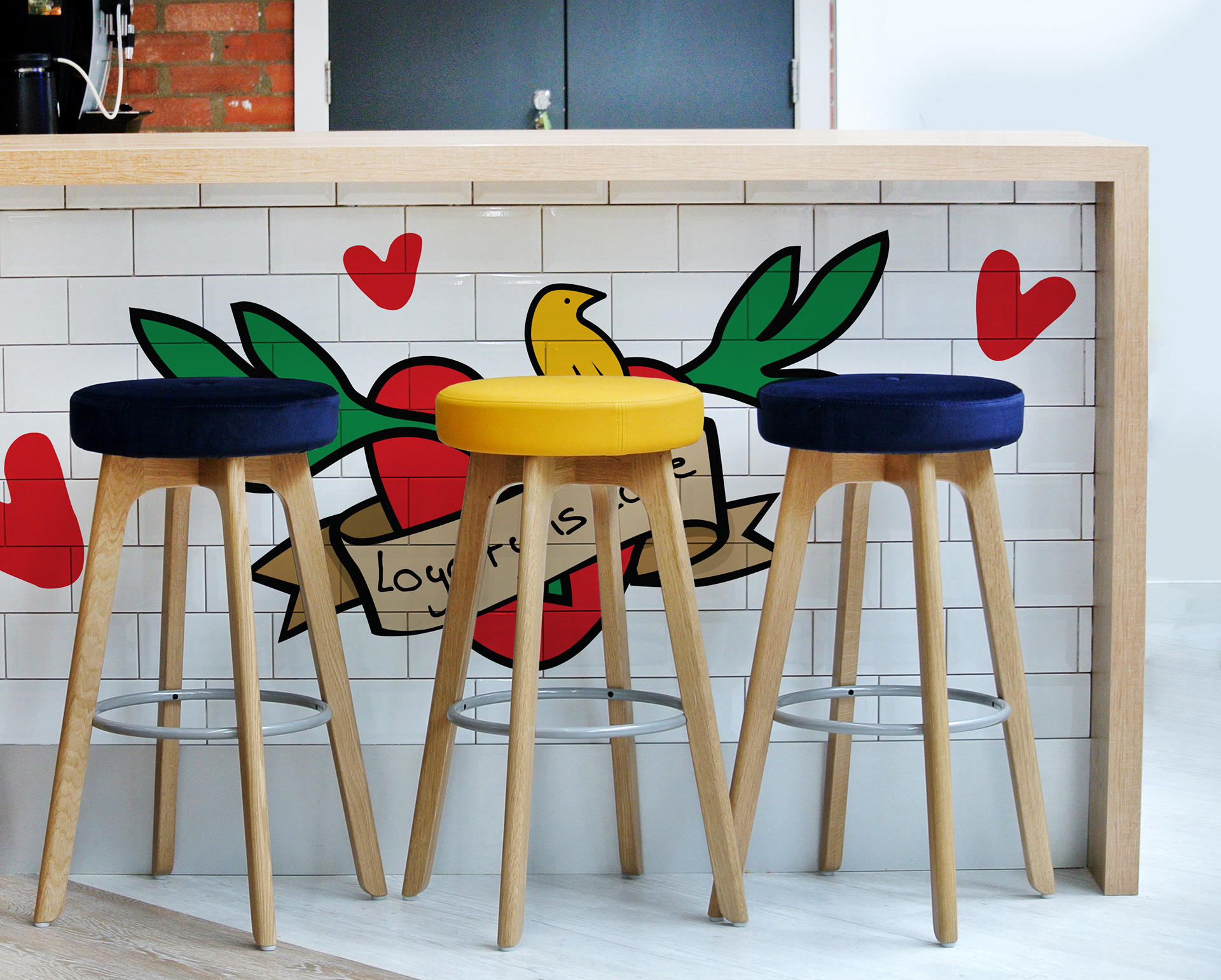
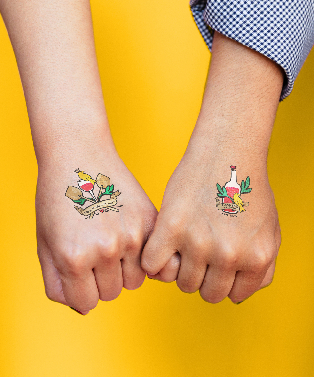
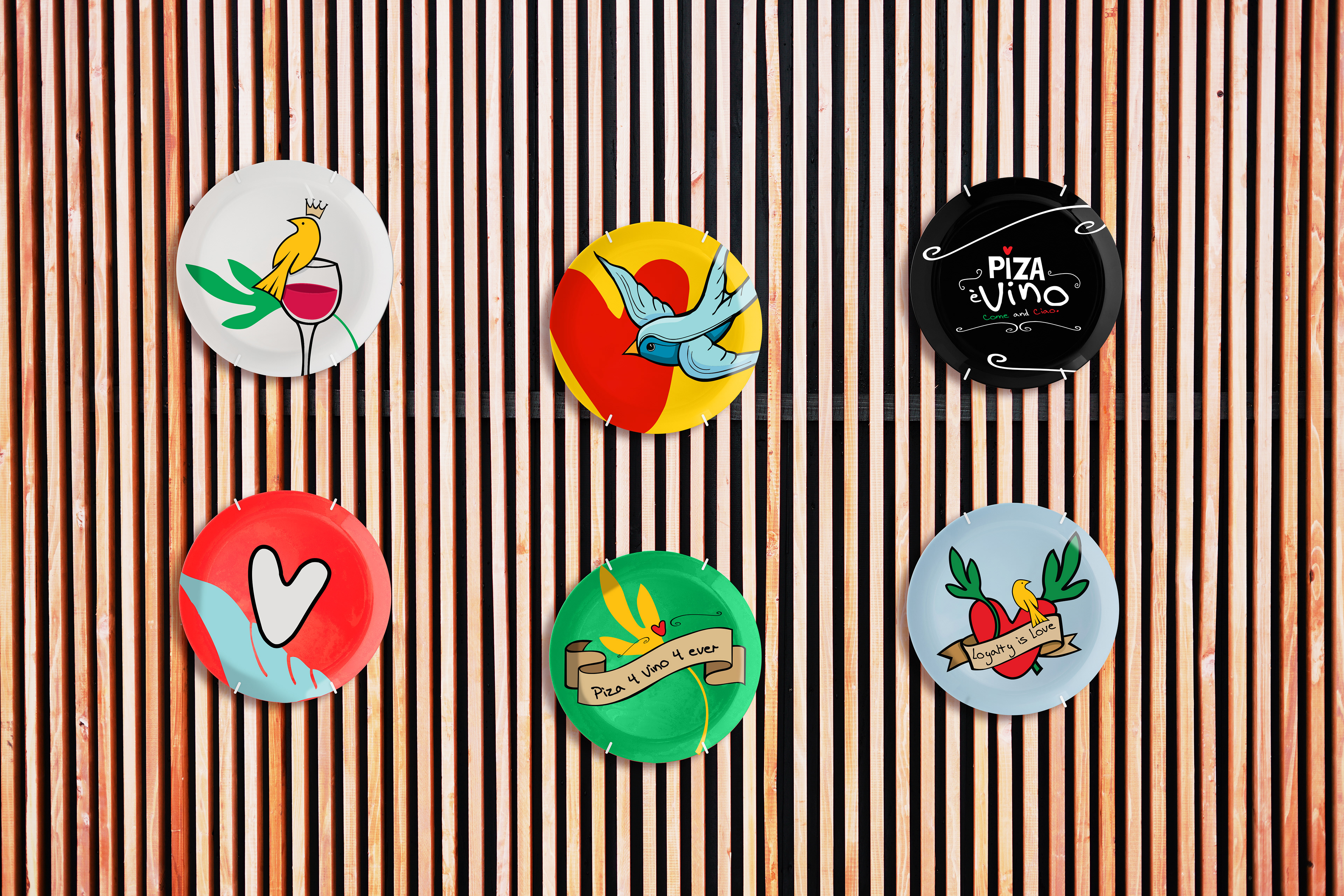
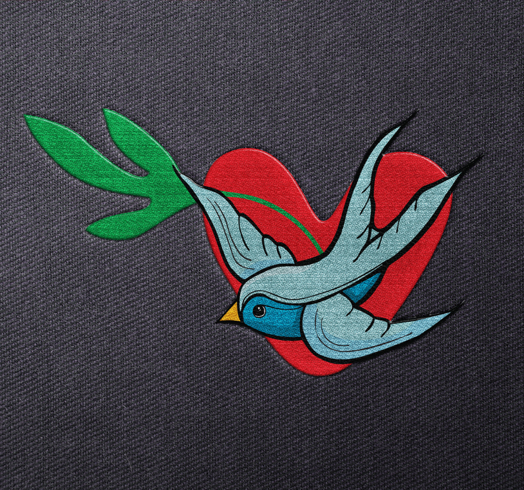
Photo credit to Karen Swanepoel Photography www.karens.co.za